How to Choose a Colour Palette for a North-Facing Room
North-facing rooms have a reputation for being dark, cold and awkward to decorate. Usually it isn't the room's fault. It's the light. With no direct sun, daylight arrives cool, indirect and surprisingly even, and it quietly shifts every colour it touches. Whites go grey. Yellows lean green. A blue-grey you loved in the shop can look almost icy by February. The upside is that north light is steady and gentle, and it flatters texture beautifully. Once you know what it does to paint and fabric, choosing a palette becomes a decision rather than a gamble. The trick is to work with that cool, even light rather than pretending it is something else.
What North Light Does to Colour
Daylight on the north side of a building has lost the golden warmth that direct sun brings. What's left sits at the blue end of the spectrum, and it desaturates everything it lands on. A colour that looks rich and confident under a south-facing window will read a shade or two greyer on a north wall. A mustard that sings in a bright kitchen can turn olive in a north-facing study. A blush pink that looks fresh in a sunlit bedroom may seem dusty and muted. Even a strong navy can lose depth and read almost black by late afternoon.
Two things follow from that. Undertones matter far more than colour names, because cool light exaggerates whatever is cool in a shade. And low light means low contrast: corners away from the window stay murky all day, so a room can feel flat rather than dramatic. In the UK, with our overcast skies and short winter days, both effects are stronger than most paint charts suggest. North light is also coolest in the morning and early evening, and it can pick up green from a garden or grey from a neighbouring wall.
North light doesn't ruin colour. It edits it, removing warmth and adding grey.
Start With the White
Brilliant white is the most common mistake in a north-facing room. It reads grey, blue or faintly lilac, and a pure white ceiling can look grubby next to it. Choose whites with a warm undertone — a touch of yellow, pink or red rather than blue or green. Words such as alabaster, plaster, chalk, bone and antique white usually point in the right direction, but every brand's version sits somewhere different, so look at the pigment direction rather than the label.
If you want a neutral that reads as a colour rather than a background, stone, oatmeal, mushroom and soft clay work well, as long as they lean warm. Mid-greys are riskier: many fashionable greiges have a blue base and turn distinctly cold. If you want grey, choose one with a brown, green or violet base — and test it on the wall, not the chip. A pure white ceiling can also make a warm white wall look yellow by comparison, so if you want subtle contrast, use a slightly warmer white on walls and a cleaner white on trim, but avoid blue-whites altogether.
Light reflectance, in plain terms
Many paint brands publish an LRV (light reflectance value) for each colour, on a scale where higher numbers bounce more light back into the room. For dominant walls in a north-facing space, mid to high values are a sensible starting point. Deep colours aren't off-limits, but they absorb the little light there is. Position matters too: the wall opposite the window receives most of the daylight, while the walls beside the window and the ceiling corners fall away. Either paint the wall opposite the window in the lightest tone you're happy with, or use the same colour across walls and ceiling to blur the edges and let reflected light travel further. If you love a deep colour, save it for a wall that receives more bounce — or for woodwork, a chimney breast or an alcove — and keep the surrounding surfaces light.
Pick Warm Neutrals, Muted Pinks and Earthy Accents
Once the white is right, build the palette around warm neutrals. Oatmeal, mushroom, putty, sand, soft clay and stone that lean yellow, red or brown rather than blue will hold their own in cool light. Accent colours can be earthy and gentle: terracotta, rust, ochre, mustard, olive, sage, muted coral, dusty rose and aubergine all bring warmth without shouting. Cool blues and blue-greys can work, but choose one with a green or violet base and balance it with warm wood, orange-toned textiles or brass.
If you want a restful room, use one dominant warm neutral across most surfaces, then repeat a second warmer tone in cushions, lampshades or art. If you want more energy, introduce a stronger accent on a single piece of furniture or a small wall. North-facing rooms rarely need more coolness; they usually need a little more glow.
Use Placement to Flatter the Light
In north-facing rooms, where you put a colour matters as much as which colour you choose. The wall opposite the window gets the most daylight and can take the lightest shade. Walls beside the window and the ceiling can fall away, so a common approach is lighter on the far wall, slightly deeper on the window wall, and the same undertone throughout. This creates depth without turning the room into a cave. Alternatively, paint ceiling and walls the same mid-tone colour to make the space feel wrapped and calm. Avoid a dark feature wall directly opposite the window unless you want to pull that wall forward; use it on the window wall instead to make the room feel deeper.
Test Colours Properly
Paint chips lie in north light. A chip held in a shop under warm bulbs will look richer and warmer than it will at home. Buy sample pots and paint A2 or A3 boards — or paint directly on the wall in two coats — then live with them.
- Paint samples next to each other, not isolated on different walls.
- Look at them at three times: early morning, mid-afternoon, and after dark with your normal lamps on.
- Check them against fixed elements: floor, worktop, sofa, curtains, and any outdoor green or grey visible through the window.
- Move the board around the room, especially into corners and beside the window.
- Choose the colour that still feels friendly on a wet Tuesday in January, not just on a bright May morning.
Add Warmth With Texture and Artificial Light
Colour is only half the story. North-facing rooms respond beautifully to texture: wool, linen, boucle, rattan, aged wood, brass, and ceramics with a matte or hand-made finish. These surfaces catch the soft light and make it look intentional rather than dim. Layer lighting, too: a warm white bulb around 2700K in table lamps, wall lights and a floor lamp will counteract the cool daylight without making the room look orange. Use dimmers where you can, and place lamps at different heights so the corners don't disappear after sunset.
Metallic finishes can also help. Brass and antique gold bounce warmth; chrome and polished nickel can reinforce the coolness. If you love silver tones, mix them with warm wood or a woven natural fibre to stop the room feeling clinical.
Three Palettes That Work Well
- Soft plaster and clay: warm chalk white on walls, a slightly deeper clay or mushroom on woodwork, oatmeal linen, pale oak, and terracotta accents. This is forgiving, calm and easy to live with.
- Sage and oatmeal: a muted green with a grey-yellow base, warm oatmeal walls, aged brass, dark wood, and a touch of rust or mustard. Green works especially well if your north-facing room overlooks a garden, because it connects inside and out rather than fighting the green cast.
- Warm charcoal and blush: a soft charcoal with a brown or violet base on a chimney breast or lower wall, blush pink and ivory above, and warm white trim. The dark tone adds contrast, while the blush keeps it from turning cold.
Mistakes to Avoid
- Buying paint online from a screen without testing it in the room.
- Choosing cool white, blue-white or grey-white for walls and ceilings.
- Assuming a colour name means the same thing across brands.
- Using several different undertones in one room, which can make a north-facing space feel restless and dingy.
- Ignoring the floor and fixed furniture, which reflect their own colours onto the walls.
- Relying on one central ceiling light after dark.
The good news is that north light is consistent. It doesn't glare, fade or shift dramatically through the day, which means once you find colours that work, they will keep working. Choose warm undertones, test them patiently, and use texture and layered light to add depth. A north-facing room doesn't have to be the coldest in the house. Handled well, it can be the calmest, most restful and most flattering room you have.
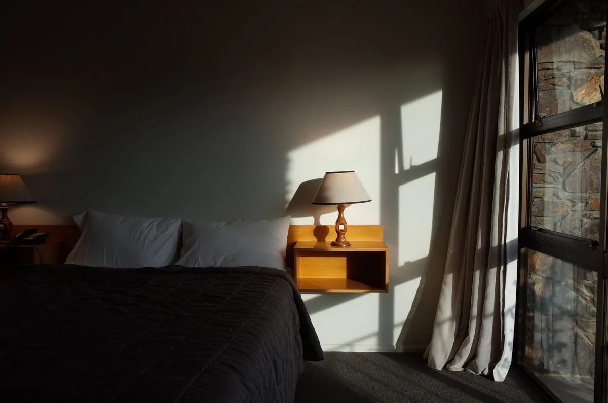
Photo: mingche lee / Pexels