Geometric and floral are the two pattern families people most want to put together, and the pairing most likely to end in a headache. A wide awning stripe beside a blowsy rose print can look like two rooms arguing through a doorway. Shift the scale, borrow a colour and leave some quiet ground, and the same two fabrics suddenly read as intentional.
Nothing mystical is going on. Three variables do almost all the work — scale, colour and negative space — and one early decision about which pattern leads keeps the rest in line.
Decide which pattern leads
Every pairing needs a boss. Choose one pattern as the main voice and let the other support it. In practice that means the lead pattern covers the larger area or sits on the most prominent surface: curtains, wallpaper, a rug, a sofa. The supporting pattern arrives in smaller doses — cushions, a lampshade, a table runner, the inside of a bookcase.
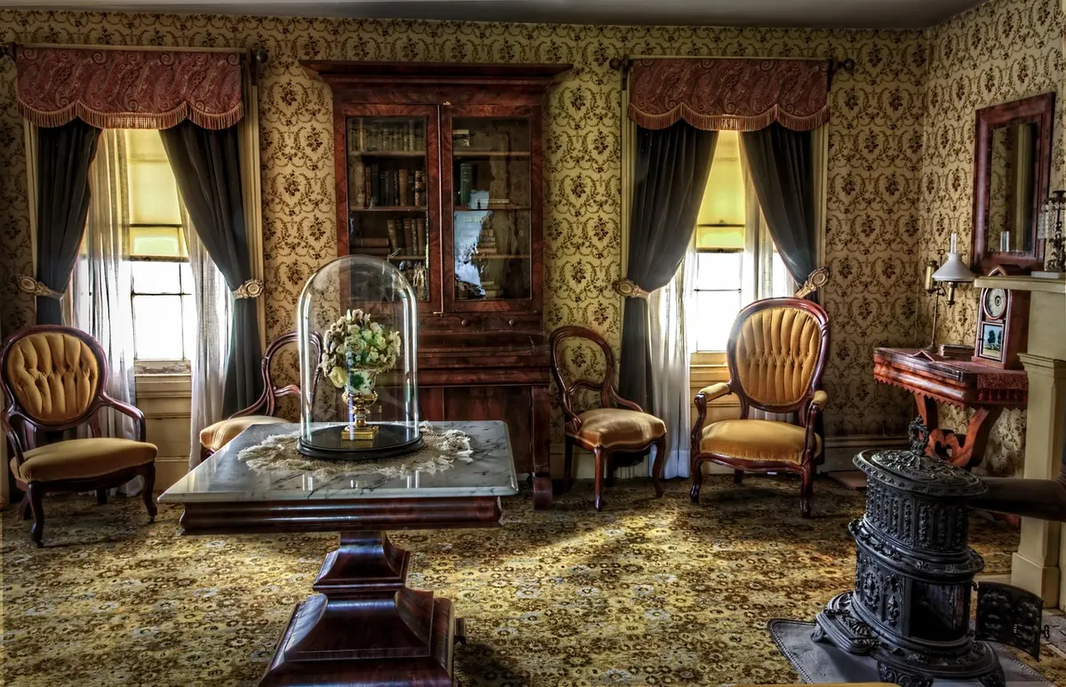
Geometric usually leads best in rooms with strong bones: original cornices, clean-lined joinery, a tiled fireplace. Stripes and grids echo straight edges, so they feel at home. Florals tend to lead in softer rooms, or wherever the pattern has to cover a lot of wall and needs to feel generous rather than rigid.
The mistake almost everyone makes first is treating the two as equals. Two patterns of similar weight on similar surfaces give the eye nowhere to rest. Give one of them a clear job and the room settles.
Worth remembering: a plain textured weave is not a pattern. Linen, slubby cotton, wool bouclé and chunky knits give you neutral territory, and they are the cheapest way to buy calm.
Get the scale contrast right
Scale is the single most useful lever, and the one beginners skip. Think in three sizes: large, where a motif is bigger than your hand; medium, roughly palm to plate sized; and small, under about 10cm, often a tight 2–3cm ditsy. Then follow two rules.
- Never pair two patterns of the same scale. Same-size motifs compete and cancel each other out.
- Make the jump obvious. If the floral is large and loose, the geometric should be small and tight — a fine pin-dot check, a narrow ticking stripe. If the floral is small and ditsy, a chunkier geometric can answer it.
Most reliable combinations are one large pattern, one small pattern and one plain. That is it. You do not need a third print.
Scale depends on distance
A 5cm check on a cushion looks almost plain; the same check across a whole floor looks busy. Judge scale from where you will actually see it — from the doorway for curtains and wallpaper, from the sofa for cushions.
Use colour as the glue
Colour holds mismatched patterns together more reliably than any other trick. There are three ways to do it, and any one of them is enough.
- Share a palette. Pull two or three colours straight from the floral — dusty pink, sage and cream, say — and choose the geometric in one of them.
- Share a background. Put both prints on the same ground: both on cream, or both on ink navy. They will look like relatives immediately.
- Repeat one accent. A single colour appearing in both patterns, even in small quantities, quietly links them.
What to avoid: two prints each carrying a full rainbow with no overlap between them. Also avoid near-misses. A sage green that is almost, but not quite, the sage in the floral reads as a mistake rather than a choice. Match exactly or go clearly different.
Leave negative space
Negative space is the calm ground around a motif, and it is why some patterned rooms feel restful while others feel loud. At least one of your two patterns should have generous breathing room — a sparse trailing floral on white, a thin-pin grid on ivory, a stripe with wide gaps between the lines.
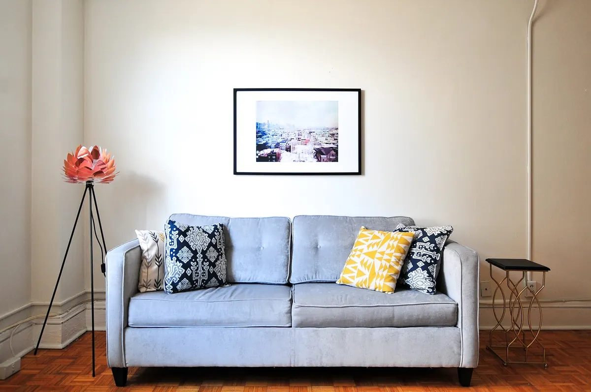
Then apply the same idea to the room. Keep the biggest surfaces plain: walls, floor, sofa. Let the patterns live in the layers you can change — cushions, throws, a shade, a rug, framed fabric. When two busy prints sit on the same surface with no plain fabric or empty wall between them, they fight no matter how well the colours match.
A working formula in six steps
- Choose the floral first and note its three main colours.
- Pick one colour as your neutral ground — usually the palest or the darkest.
- Find a geometric in one of the other colours, at a clearly different scale.
- Add a plain textile in the third colour to sit between them.
- Stand back three metres and squint. If you can still see both patterns, the balance is right.
- Add a third pattern only if it is tiny or heavily textured.
Five checks before you commit
- Is one pattern clearly larger than the other?
- Do they share at least one colour exactly?
- Does each print have plain ground around its motifs?
- Would the room still work if both fabrics were turned to their plain reverse?
- Are the patterns on smaller surfaces than the plain fabrics and plain walls?
Start small, then live with it for a week
Buy two cushion covers, or a tablecloth and napkins, before you commit to curtains or a rug. It costs little and it tells you almost everything. Look at the pairing in daylight, in lamplight and in the grey light of a wet Tuesday — colours shift, and a combination that sings at noon can sulk at nine in the evening.
If it works, scale up one surface at a time. If it does not, change the smaller element; cushion covers are far easier to replace than wallpaper. Give it a few days. Pattern mixing often looks wrong for about a week and then, once your eye has learned the rhythm, it looks as though it was always meant to be there.
Photo: StockSnap / Pixabay